Designing the invisible
Why the best interface decisions often happen before the interface exists.
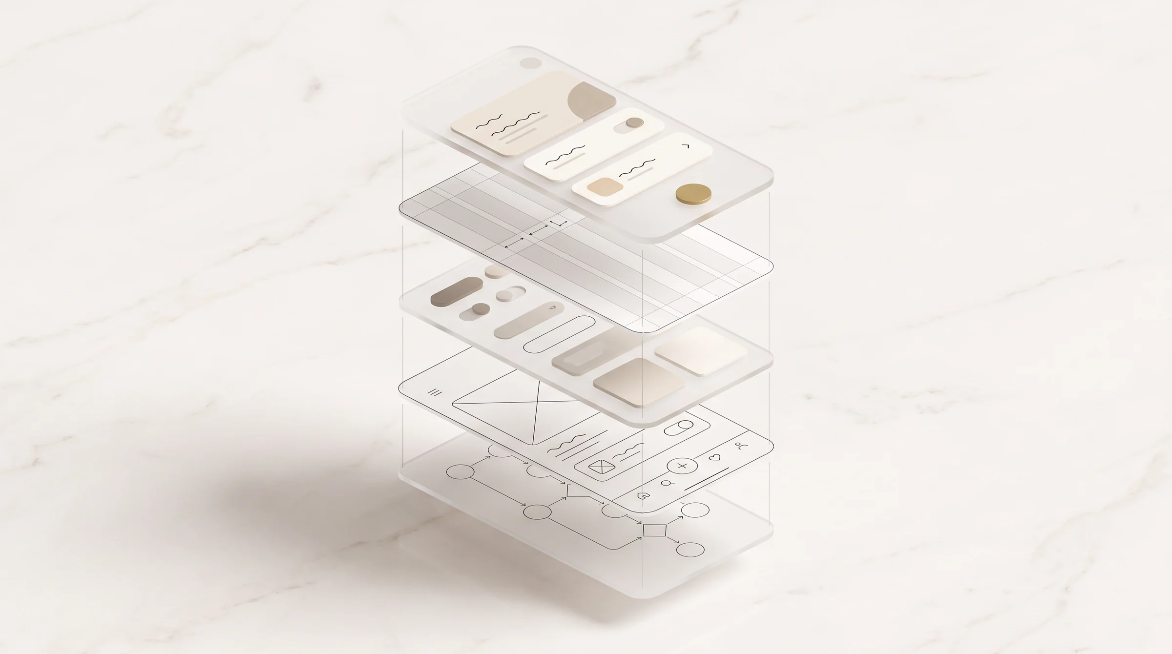
A polished interface is easy to see. The decisions that made it feel simple usually aren't.
When a product feels calm and obvious, it's tempting to give the credit to what we can see: the type, the spacing, the motion. But most of the work happened earlier. Before the pixels, before the components, sometimes before Figma was even open.
The screen is only the surface
A screen is where a product finally becomes visible. Underneath it sits a much larger system: goals, business rules, permissions, states, and all the strange little situations nobody remembers until they happen.
What if there's no data yet? What if there's too much? What if the payment fails, or two people are allowed to see different things?
A beautiful screen can hide these questions for a while. It can't answer them, and sooner or later the user finds them. That's why I don't think of UX as arranging things on a page. I think of it as deciding how the product behaves. The interface is just where those decisions become something you can touch.
Structure before screens
Figma makes it dangerously easy to make an unfinished idea look finished. Add a shadow, a label and some placeholder data, and suddenly it looks convincing. The hard questions are still underneath.
So before I design the surface, I map the system. Who is here, and what are they trying to do? What can they see, and what can they change? What happens next, and where can it go wrong?
A messy flow diagram has solved more product problems for me than ten polished screens. It isn't glamorous. It's usually the most important part.
Complexity doesn't disappear
Simple products are rarely simple systems.
When we make an interface feel simple, we don't remove complexity from the world. We decide where it lives. Good design carries more of the weight so the user carries less: the system remembers, defaults take away needless choices, hierarchy shows you where to look, and constraints prevent mistakes before an error message has to explain them.
The user doesn't need to understand all of it. That's the point.
Design the uncomfortable states
Perfect data is very cooperative. Real products aren't. They have empty screens, expired sessions, failed payments, names three times longer than expected, and people who press Back at exactly the wrong moment.
These moments never look impressive in a portfolio, but they're where trust is built. A dashboard full of ideal data shows me what a product looks like. An error state shows me whether it understands what just happened to me.
So I don't only ask what success looks like. I ask what happens when it doesn't come.
Calm isn't the same as minimal
I love calm interfaces, but calm doesn't mean empty. A financial tool may need a dense table. An admin panel may need twelve actions. Some forms really do need twenty fields.
Pretending the complexity isn't there only makes a product harder. Calm comes from giving it order: hierarchy, sequence, rhythm, and the feeling that the product knows where you are and what you're trying to do. That comes from structure, not decoration.
Why I see it this way
Before I designed interfaces, I worked in IT and studied theatre. Two very different worlds, and both changed how I think about products.
IT taught me that systems break in places nobody planned for. Theatre taught me that an experience has rhythm: you decide what the audience sees, where their attention goes, and what has to be in place before they walk into the scene.
Interface design feels surprisingly similar. The audience shouldn't see everything happening backstage. But backstage still has to work.
The invisible part is the design
I care deeply about craft: type, spacing, motion, colour. It just works best when it gives form to something that already makes sense.
What interests me most now is everything underneath. The flows nobody notices. The edge cases that never become support tickets because someone thought of them early. The small piece of context that stops someone from hesitating.
The interface is what people touch. The invisible part is what makes it hold.